Crafting the Perfect Social Media Profiles

Lets be real for a moment, more than three quarters of people in the U.S. alone are using social media (I’m sure it is probably higher than that, but allow me to use my outdated data). The majority of these social networkers are following a brand or even a thousand. With social media becoming the online marketing tool, it’s becoming much harder for brands to stand out – and Facebook making it pay-to-play isn’t helping. This means that good design, especially for smaller brands, is necessary.
Here are some guidelines on making the most of the social networking platforms, style-wise at least. While this post focuses on Facebook and Twitter (which are the most used by brands and have the easiest customizable features) the same principles can be applied across platforms.
Have a clear and simple message for your followers.
A good profile is simple and direct about what the company sells and its personality. Choose images that identify the brand and tell its story.
Pay attention to the “about me” fields. Be descriptive but concise, and don’t forget to leave your contact information to help people learn more about you.
Avoid using text in images when possible.
When creating cover and profile images for your social media platforms, keep them clean. Lots of wording just takes away from the visual impact of the profile.
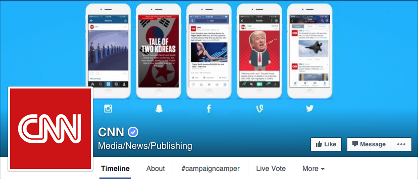
Turning a recognizable logo into a profile picture may seem like an obvious choice, but many brands with text-heavy logos opt for something else.
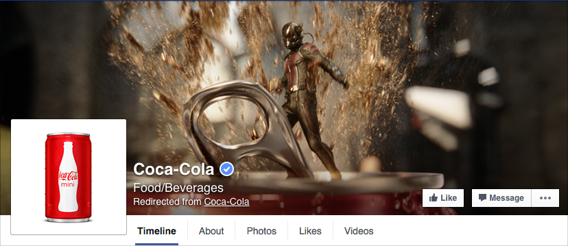
Coca-Cola has (arguably) the most recognizable simple text logo in the world – yet their profile uses a picture of a Coke bottle to represent itself across platforms. The image of the bottle on a white background reads much better on a small scale than its trademark cursive.

Disney also opts for a picture of Mickey instead of its logo with its still baffling Disney “D”.

Facebook even restricts the amount of text that can appear in ads and sponsored posts that will appear in their news feed to 20 percent of the entire image. While this principle doesn’t apply to cover photos or profile pictures, it’s a good reminder to keep text out of images as much as possible. You’ll end up looking like spam if you’re too text-heavy.
Most brands use a combination of a graphic image for their profile picture with a photographic image for their cover photo.
Keep branding consistent and up-to-date across platforms.
Most brands now have a presence on multiple platforms to catch the broadest audience possible. But like other aspects of marketing, it’s necessary to keep the design of profiles across platforms as consistent as possible. This means using the same profile picture and the same cover photo when possible.


It’s always a good idea to keep social profiles up-to-date with fresh pictures with information on new projects. Media companies often change their profiles to reflect upcoming releases, like this PBS cover photo.

Just make sure that when one profile is changed, they all change to match. Keeping a list of every social profile a company maintains can help cut down on inconsistencies across platforms.
Want more tips? Keep reading.


